Hello, there!

I'm a at your service.
Contact me at alton.chaney@gmail.com

Selected Work
Wedge

Wedge App

  • Design
  • Development

A Trading + Spending App

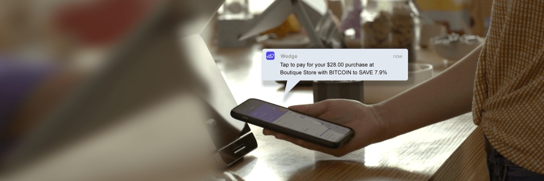
Wedge is on a mission to bring the power of the market to everyone for everyday spending, removing the friction between trading and spending allowing users to responsibly put all their money to work to save on everyday spending, while incentivizing good financial planning. The app allows users to trade Stocks, ETFs, and Cryptocurrencies and use their gains instantly to cover any transaction made with the Wedge debit card.

« Scroll »

Creating a Native Trading App

I currently lead our efforts with the development of Wedge’s core React Native application, utilizing modern toolsets such as Hooks and Redux to optimize performance as much as possible. This includes integrating a few custom native iOS and Android toolsets into our application that allow for users to take advantage of features such as 'Add to Wallet' functionality to seamlessly add their Wedge card to their device wallet. In addition to developing new features we've made sure our app has robust unit test coverage and has our core flows tested against our API with E2E testing. With some of our banking and card partners it remains essential that we remain in full compliance with their rigorous standards as well as ensure nothing ever happens to a user's cash or holdings.

Improving the Complex Financial Experience

With our complex onboarding process it's been crucial to make that process as painless as possible and so in addition to development, I've helped design and optimize our various workflows over time to drive better conversions and usage of our app. This includes features like a native iOS Widget that gives you an instant look at your asset holding performance and in app comparison graphs for a look at your coverted gains month over month.

Personal

Cosmere Maps

  • Design
  • Development

An Interactive Journey Map

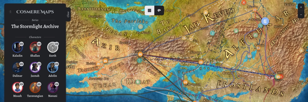
As a fan of Brandon Sanderson's books, it always struck me as difficult to visualize where characters are in the complex fantastical worlds he likes to set his novels in, even with the included maps. With this project I wanted to provide a fun mapping tool that allows readers to select exactly where they are in one of the Cosmere novels and see precisely where any of the primary characters are and have been at that moment.

« Scroll »

Improving the Standard Map Experience

With Leaflet's simple mapping toolbox, it was easy to stand up a interactive map that allowed me to use high quality maps of the various Cosmere books and draw various interactive items on top of those like markers or paths. I decided on using React for the app's base which allowed me to keep the various components and data sets abstracted from the end view and simply add new data as I went along. I also extended the Leaflet toolbox to allow for multiple map layers, a necessity for Sanderson's typical parallel 'realm' world structure.

No Spoiler Zone

While getting the map set up was great and validated my needs for the tool, I wanted to ensure it was a tool worth using as you read along and wasn't simply static and spoilery for new readers, so I fleshed out visibility selectors for books, characters, and even chapters in the most recently selected book. In addition, I made sure the map 'saved' the user's selections if they left or refreshed the app.

Ruckit

Ticket Manager

  • Design
  • Development

A Trucking Ticket Digitizer

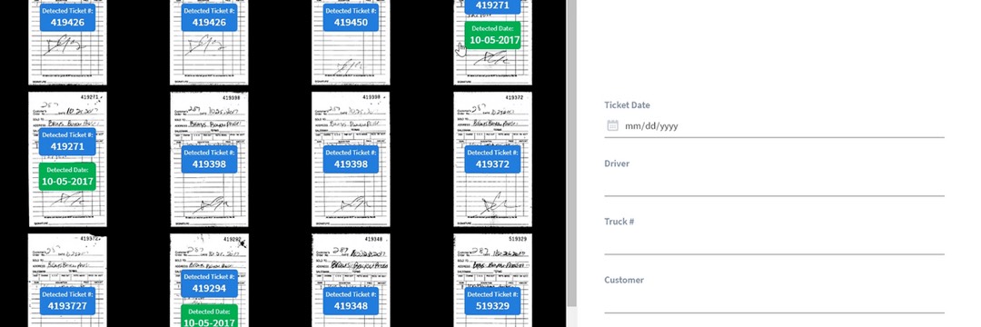
With the Ruckit Ticket Manager, trucking companies are able to take the hundreds of various paper tickets they recieve each week and, utilizing OCR and ML technologies, digitize those tickets in a far more efficient manner than the typical manual process, shaving down time spent getting tickets into a database from a days long process to minutes.

« Scroll »

Extracting the Utility from OCR and Scanning

During a hackathon I proposed the idea of a 'bulk uploader' which ingested hundreds of tickets at a time, allowing users to bulk associate data using their existing Ruckit data (which continually updates if they decide to add new trucks/jobs/etc.), and the project was deemed efficient enough from all ideas proposed to be pursued as a legitimate product for the company. As development got underway, I spent a lot of time beefing up extra features that turned into core functionality, including a robust OCR pipeline which uses ticket context to detect ticket numbers, weights, and dates, as well as a direct to website scan pipeline which allows user to scan tickets directly from a scanner and see those scans show up on the website with the OCR results already populated.

Improvement via Direct Feedback

Thanks to the intimate relationships we keep and maintain with our existing Ruckit customers, we were able to roll out the Ticket Manager in a fast and easy way to a select group who wanted it the most for their business. With this feedback loop in place we were able to get the product in people's hands in months instead of the years it might take otherwise, as well as gain valuable insights and feedback upstream in the development process that was able to shape our priorities upfront as opposed to being purely reactionary when it comes to implementing feedback.

Personal

Alamo Alerts

  • Design
  • Development

A Ticketing Alert App

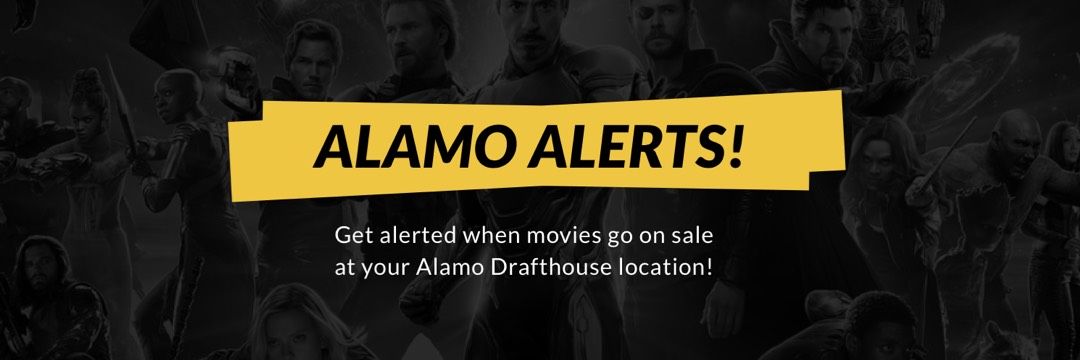
Alamo Alerts generates alerts on the fly when new movies are detected at a number of Alamo Drafthouse locations. These alerts can be found on a dedicated responsive website, or any of each location's individual Twitterbots which can give followers push notifications so they get the best seats for the newest movies.

« Scroll »

Creating The Initial Alerter

This project started out when I got fed up with not getting any good seats when Drafthouse would send out emails for new showings, generally hours after the listing was made available on their actual website. After doing a little digging, I found that their ticketing API was open and public so I created a simple Python script to parse and digest the API as well as create entries on a simple database where I could reference what films had been detected previously. Once I was successfully able to stand up this script, I created Twitterbots for specific locations in Austin I wanted to be alerted about and set up the scripts to push Tweets to those accounts. In addition, a simple Vue site was set up to consume and display this data that surfaced the relevant RSS and Twitter feed links for each location.

Expanding the Script and App

One core feature I made sure to include (and one I hadn't seen before in any alerting system I had come across) was a way to have an additional alert when a theater would add screens to a film's opening weekend, opening up an additional opportunity to get the best seats in the house. To that end, I expanded the script to save and reference all of a film's opening weekend showtimes and look for any new times, as well as append badges to both those Tweets and the website.

Ruckit

Dispatch

  • Design
  • Development

A Trucking Management App

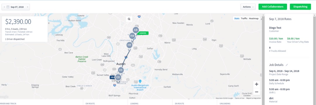
Ruckit Dispatch is a platform that allows companies in the heavy construction and materials industry to collaborate and track all of their owned and third-party trucks. The platform reduces manual tasks like phone calls to drivers and paper ticket submissions. It also streamlines data entry for easy billing and invoicing.

« Scroll »

Transparency Through Data

The Ruckit App, built on a solid Angular foundation, was already fully featured by the time I came onbaord the team, with many of the basic workflows already developed. With my design and dev background I was tasked with identifying and implementing improvements where I could find them in addition to typical maintenance and upgrade work, as well as expanding heavily on our front-end tests. Many of these improvements optimized our core dispatching flow heavily, adding features such as scheduled starting and timeline views which allow accountants to properly pay our drivers accurately based on our extensive GPS and driver submitted data.

Internally, our core goal was keeping the expansive and feature heavy app as efficient as possible, so we strived to continue making components as reusable as possible, both as they were being made, and retroactively with help from our design team which allowed us to modify specific components as needed so we could trim down our codebase and make the website perform optimally even on older machines. To that end, we continually upgraded Angular and relavant libraries as improvements were rolled out, as well as strived to keep our testing code coverage as complete as possible with all scenarios accounted for.

Insitome

Traits

  • Development

A DNA App Collection

Insitome delivers immersive genetic experiences that empower, educate, and entertain. The company values scientific innovation, storytelling, and design, and its products help reveal each fascinating chapter in the incredible and mysterious story of you.

« Scroll »

The Story of You, Chapter by Chapter

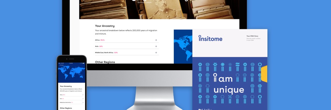
At Insitome we grew our core DNA reporting product using a piecemeal 'applet' model which allowed us to develop specific reports tailored to different types of information provided by genetic data, such as interactive maps to accompany Ancestry results, and DNA inheritance percentages that tell users how much of their genome was inherited from Neanderthals or Denisovans.

Your Genetic Data Whenever You Want

Creating such a wealth of uniquely-featured applets required a modular and robust front-end that could be tailored and data-driven entirely by a wealth of API endpoints that were designed to be extendable. These endpoints not only provided the necessary genetic data for users, but also unique result-based content as well as choosing UI elements and styles that were easily utilized using a base front-end component system. This system was designed to be consumable on any device, from mobile to desktop.

Snap Kitchen

Snap Online

  • Development

A Responsive Meal Planner

Snap Kitchen is a one stop healthy meal shop, providing you the healthy, delicious convenience of having personal chefs and nutritionists design your meals every day. Skip the cooking and stock your fridge with pre-made, nutritionally-balanced meals that are ready to heat and eat!

« Scroll »

An Overhauled Web Experience

The Snap Kitchen website, while robust enough to provide basic menu and location data, was in desperate need of a sweeping overhaul to follow along with the stores rapid country-wide expansion, allowing people from different cities to get location-accurate data as will as eventually provide the ability to order Snap food online and get that food delivered using a third-party delivery service. Using up-to-date web app and backend technologies, our engineering team was not only able to implement this functionality, but also go above and beyond, giving users info they might not know they needed, such as real-time store outages, holiday hours, and food stock updates.

Always Accurate, Always Up-To-Date

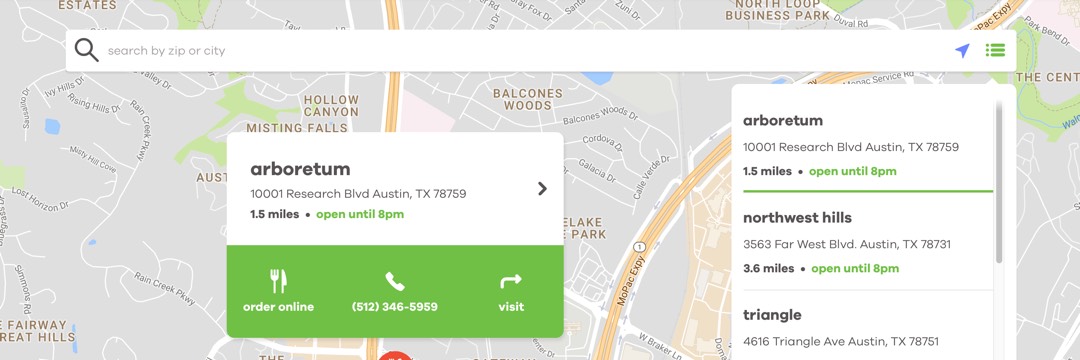
Snap relied on myself and a team of backend engineers to update and improve the existing Snap Kitchen website, preferring a gradual update over a full single release of all of the improvements. This sequential plan called first for the complete redesign and overhaul of the store locator, which was updated on top of Snap's existing Angular platform. I developed a full view interactive map that seemlessly integrated search functionality and a full-breadth location overview that provided store hours and location specifics in addition to providing useful info such as upcoming or active holiday hours. Next I was tasked with integrating with the Snap rewards system, creating a dynamic way to generate bar codes and display real-time reward balances based on a user's account data.

Old POS System, New API Tricks

In order to enable the integration of the most up-to-date and accurate info, our engineering team worked to integrate with Snap's existing Point-Of-Sale system which was updated to be REST-complaint and easily digestable on the web, while also ensuring all of the requested data was as accurate and error-free as possible. The end result was ensured up-to-date data that we were certain was the same location and food info a customer would get from a store or customer service.

Glasses.com

Virtual Try-On

  • Artwork
  • Design

An Augmented Mobile Experience

With glasses.com, you can virtually try on thousands of glasses and sunglasses to see how you look from any angle in photo-realistic 3D. Try on frames from Ray-Ban, Kate Spade, Oakley, Burberry, Maui Jim and more - scaled to fit your face correctly.

« Scroll »

A New Way to Find the Perfect Frames

The Glasses.com Virtual Try-On app is the breakthrough augmented reality app, accurately scanning a users face using their device's camera to generate a realistic face mesh. With this face mesh, combined with a library of thousands of high-quality frame models, users are able to 'try-on' and view themselves in any pair of glasses offered by the online retailer.

Designing for the Future

This new approach to augmented reality (what we like to call 'Passive AR') required a whole new approach to traditional app design, while retaining the intuitiveness of going to the store and taking a pair of frames off the shelf. We crafted a very in-depth onboarding experience that guided users intelligently and got us the best possible captures under many varying conditions.

An Award-Winning Experience

The app was released to much acclaim and praise, remaining one of the top 100 downloaded iPad apps for over a year, and eventually winning awards at the Webbys, Communication Arts Awards, and Cannes Lions. Glasses.com is currently available for iPad, iPhone, and Android devices.

Personal

WWII Timeline

  • Artwork
  • Design
  • Development

An Interactive Webapp

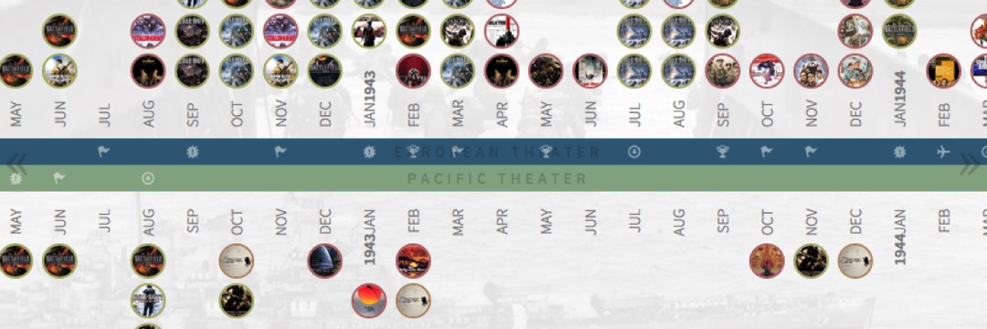
Visual Depictions of World War II is intended to give viewers an abundant collection of visual media that spans the entirety of the war and covers the majority of vital events. To that end, we've scoured several lists of WW2 adaptations and used them to compile a collection that is comprehensive enough to include not only timeless classics, but also foreign and lesser known productions.

« Scroll »

The timeline itself was designed to be accessible from tablets and desktops, enabling users to take advantage of the touch-based design and interact with the timeline from the comfort of their couch while they enjoy or plan to learn more about WWII. While the intention wasn't to try and supplant factual world history, this project is meant to enhance and pique the interest of those who would otherwise gloss over the numerous books of information on the subject.

Personal

Backwords

  • Artwork
  • Design

An iOS Party Game

Backwords is a fun and entertaining game of guessing words in reverse. Choose a word and send the recording to your friend. Your friend will hear your word played backwards and then mimic exactly what they hear.

« Scroll »

Flipping The Script, Literally

The biggest challenge in designing BackWords was definitely the process of guessing an opponent's world, which on paper sounded daunting, and definitely provided quite the challenge. After settling on a color scheme that involved a variety of colors, it became clear that color and symbol drive clues helped guide players through the process, resulting in fast gameplay and quick turnaround for opponents.

IOC

Olympic Games

  • Artwork
  • Design

A Social Integrated Webapp

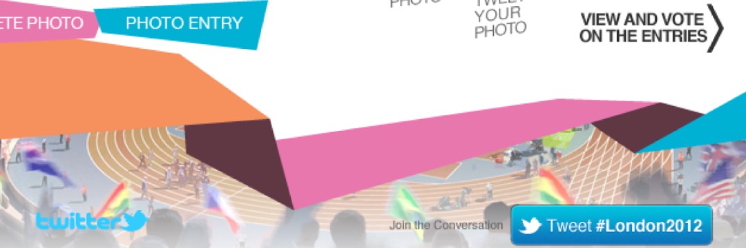
This iPad application allows fans of the Olympic Games to attempt recreations of iconic Olympian photos and enter them into a competition to win a trip to the 2012 London Olympic Games.

« Scroll »

Engaging Olympic Fans in a New Way

The International Olympic Committee, or IOC, had used Mass Relevance a year prior for the Youth Olympic Games, and approached us again to create another social-based app for the “I Copy U” competition they were holding for the 2012 Summer Olympic Games in London. I was tasked with coming up with the visual design of the app, and discussions regarding the app's functionality began with representative from the IOC. After a couple weeks of brainstorming and some back-and-forth, the IOC and those of us working on this project felt comfortable enough to move forward with designing and building the app.

Giving Depth to the Depthless

To give the app a bit more visual fidelity I incorporated an image element to give the background a bit more depth, which it lacked due to the flat elements required by the branding guidelines. We had used a more sporty typeface for our last IOC app, and for this we decided to go with something less rigid and more plain, so in the end we used Helvetica Neue. After finishing up the design, a team of developers built the app, and it was a huge success upon it's release, exceeding the IOC's expectations in generating social content and presence.

The Gaming Project

Planet Kung Fu

  • Artwork
  • Design
  • Development

A Web-Centric Unity Game

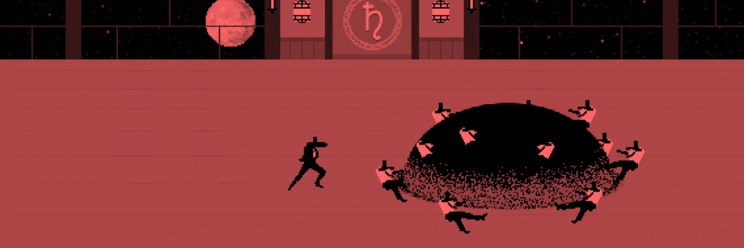
In this HTML5 action side scroller, you play as an unnamed protagonist and are tasked with showing the planets your worthiness with a true kung fu display of their majestic powers. The powers of each planet come and go at random, forcing you to adapt your fighting tactics at the mercy of the planetary gods.

« Scroll »

A Vibrant, Action-Filled Homage

Created and executed in less than 72 hours for the Ludum Dare, Planet Kung Fu was TGP's love letter to the Kung Fu genre, keeping the fight as the core gameplay experience. Using a variety of animation techniques including extensive rotoscoping of old Bruce Lee movies and incorporating a vibrant color palette, Planet Kung Fu became our highest rated LD game to date, propelling us easily into the top 100 out of over 2000 entries.

The Gaming Project

Urban Sprawl

  • Artwork
  • Design

An HTML5 Videogame

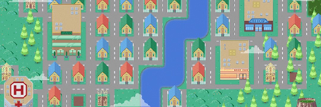
The town of Jarlsberg is booming. Residents are flocking and buying up plots of land at a record pace, and it's up to you, the Mayor, to give these residents the amenities they need in order for Jarlsberg to stay afloat and ensure you don't go bankrupt.

« Scroll »

The Mechanics of an Ever-Growing City

Urban Sprawl began life as a Ludum Dare entry, a contest in which teams of game developers are tasked with creating a game from scratch in 72-hours or less based on a specific theme, in this case being "Evolution." My team, The Gaming Project, landed on the idea of an evolving city, and began to map out the specific mechanics that would be involved in gameplay. While our lead programmer started work on the mechanics, I came up with a pixel-art style utilizing a palette of reds, greens, and blues for each of the structures in order to visually differentiate them.

Things Get a Bit More Pixel-y

After the Dare had ended, we knew Urban Sprawl had to come to mobile, and so development started on Android and iOS versions of the game. I knew that while the current artwork for the game held up for a game made in 72-hours, it would have to be updated to meet the quality users come to expect in the finest mobile titles. I started by upsizing the current structure assets to include more detail, as well as modifying the current buildings to closely match their real-world appearances. For the UI, I kept it simple, relying more on contextual pop-ups and notifiers.

Binocular

Scrub

  • Artwork
  • Design
  • Development

An Interactive Photo Viewer

Scrub is a fully-fledged concept for a social network where users could submit and view interactive short clips, allowing people to dive right to key moments in clips like a sports replay or a little bit of a rough and tumble. With its easy-to-use clip editors, making and sharing Scrubs is as easy as 1-2-3 (Seriously, it's only three steps).

« Scroll »

It All Starts with a Problem

The idea for Scrub came when a co-worker was showing us various sports clips, but had to start over the clips to replay the key moments, and so we came up with the idea to utilize full user control of a clip, using only a finger to 'Scrub' through a video. Once the idea coalesced into a solid gameplan, I was tasked with designing and putting together a functional front end for the service.

Editing and Sharing Made Fun

With a wealth of existing social networks to draw inspiration from, creating a compelling browsing experience took no time to develop, but paring down the headache of video editing is no easy task, and several proposals and ideas came and went from the drawing board before the current implementation came to be, ensuring as little time as possible was spent outside of browsing.

Est. 1989

About Me

  • Development
  • Design
  • Artwork

An Introduction

With experience in an array of skills and technologies, my goal in any work I help create is to make people happier, whether that comes from a life-changing experience, or one less tap. My passions lie in software design and development, where I’ve specialized in both mobile and web platforms, often utilizing bleeding edge technology like AR/VR or OCR. At home I’m a proud father and husband, and you’ll often find me on a run or diving into yet another book or game. Combine all of these things in one harmonious package, and you get one finely bearded human being.

Proficiencies